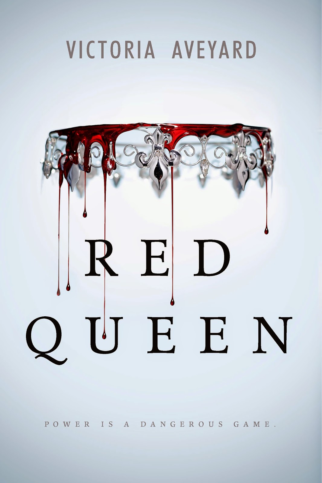
So as most of you know, the cover for RED QUEEN was revealed last week. For the .01% of you who missed my avalanche of tweets on the subject, here it is again:
Sorry, I started to drool. I’m so in love with this cover. It’s everything I wanted, and then some. The folks at HarperCollins were really open to my original idea of a cover, and then ran away with it and made something better than I ever imagined. So who wants to see my original thoughts (because I procrastinate by designing covers)?
Back in the day when I was first penning the RED QUEEN manuscript, I would dip into Photoshop whenever I hit a roadblock. I designed symbols and covers or just manipulated photos until the ideas started flowing again. Here’s the first real RED QUEEN centric image I made (and stupidly included on the first page of the manuscript):
Pretty basic, but definitely gets across a clear message. Girl, crown, chess piece. Bam. And then I started to simplify even more, and tried my hand at a minimalist (hard to understand) cover:
The symbols are nonsensical until you read the book, and even then, they’re kind of hard to figure out. Also, I very clearly made this with rudimentary paint tools in Photoshop. Well done, me.
This is the final sketch I made when I knew a cover would be a real thing, and I wanted to jot something down so I had a better chance of explaining it to Kari Sutherland, the editor of RED QUEEN:
Not too bad, but definitely nowhere near the level of beauty we ended up with. And to illustrate exactly how easy the cover process was for RED QUEEN, this was what I told Kari when she asked about cover ideas:
“Uh, simple? I figure a crown upside down to show the world is not quite right. I’m big into simple, symbol covers.” And then I sent her a bunch of covers I liked, including:
Kari had the idea to add dripping blood and the Harper art wizards translated that into our first comp cover. It was a rough draft, but I still loved it, and leagues ahead of where I thought the cover would start:
So close to the final right? It only took Harper a single comp to nail down the cover of my dreams. A true miracle, if all the cover horror stories I’ve heard are true. A giant thanks to Kari, Suzie Townsend, Kristen Pettit, Jennifer Klonsky, jacket artist Michael Frost, jacket designer Sarah Nichole Kaufman, and the whole team at Harper who made this a real thing.


